
PARAMORE
PARAMORE

ASK: Art direct a musical artist you love’s new look. Design their new look, and include assets they can use for print, billboards, album covers and/or vinyl designs, and social pages

KEY WORDS: “punk all grown up”, nostalgia, matured, loud

THEME: “Punk all grown up”
Paramore is a band that knows hard times and for years, spoke to a generation that was reckoning with the weight of a world their parents saw through rose colored glasses. Paramore was constantly reinventing themselves when needed and changing alongside their fans.
Today’s Paramore is new and ready for reinvention yet again after a 5 year break. They are simultaneously looking back into who they were when they first began, while trying to redefine what “rock” is for in the wake of a “global pandemic, social unrest, apocalyptic weather, and war”.
What I’ve done with 2023 Paramore is try to make digestible chunks of inedible rage. I’ve made the feel of Paramore match the new sound; that goal being the ability to listen to the harder parts of a life we’ve all grown into.
This Paramore is discontent, extroverted, and more matured, asking themselves the uncomfortable questions and yet still looking back and taking the risks their past selves couldn't comprehend. My rebrand represents the “plethora of ridiculous emotions, the rollercoaster of being alive in 2022” that the members speak on and have woven into their new music.

MOOD BOARD


Solution 1: a new aesthetic that fits the new Paramore “plethora of ridiculous emotions, the rollercoaster of being alive in 2022”, that is nostalgic of their rock past, but different, louder, and more matured.
Solution 2: a branding change that speaks to the new message of angst and acceptance of the harder parts of life Paramore.
ALBUM COVER


A group of people in mundane, everyday scenario -- ie work party drinks -- two are seemingly unaware/ content with the unsettling world around them , symbolized by the absurd mushroom heads. Center figure is the screaming skull, almost showing the viewer an x-ray into their inner thoughts -- a painful consciousness of the current global state of being. Screaming skeleton is also in the rebrand orange to represent the orange of Hayley’s hair.
ASSETS

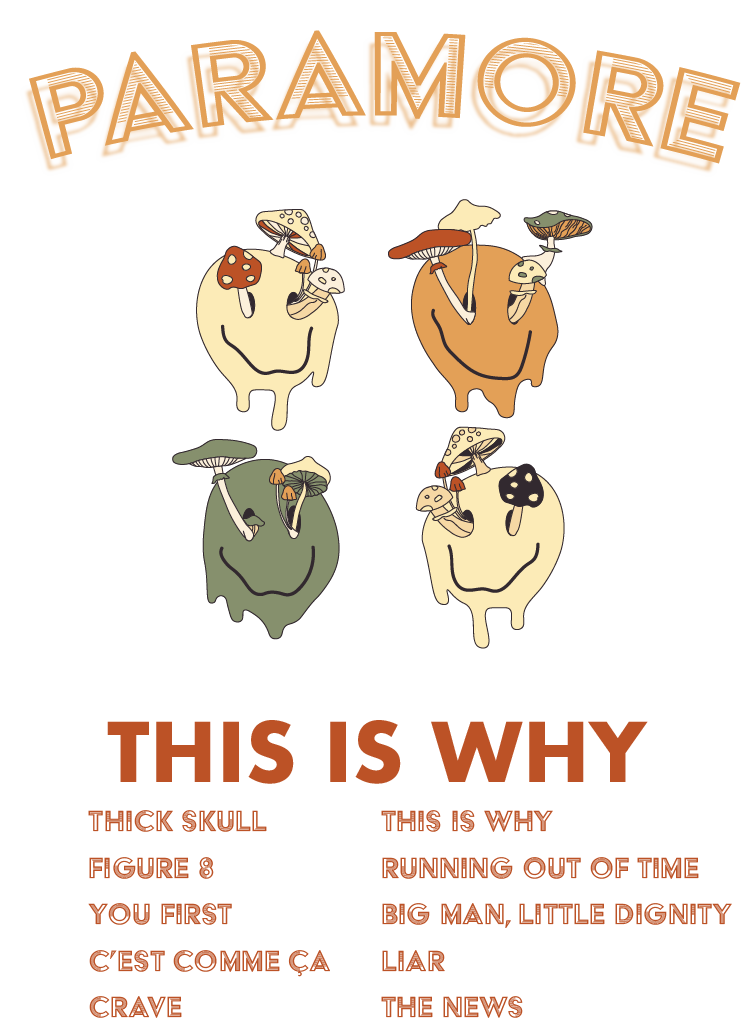


The skeleton is always orange, to represent Hayley, as a symbol for the band. While Hayley is known for her vibrant, often orange, hair colors, the orange of the skeleton is more muted to also represent her – as a conduit for the band’s – lean into maturity and extrospection.
MERCH


CONCERT TIXS

Tickets feature retro design for Gen Z. Gen Z likes tangible and misses the nostalgia they never had – the days where each event left you with a memory AND a physical momentum.
SOCIALS


PARAMORE’S INSTAGRAM WILL BE SNIPPETS INTO THEIR REBRAND.
Just as the skeleton is a peer into the inner workings of the main “character”, the socials will behave that same way and highlight rebrand and album moments
EXECU TIONS

Hayley’s of Paramore Past - the museum installation outside of concert venues with the hallway of Hayley’s past hairstyles equipped with a gift store of the different wigs for fans to wear during the concert when they get inside

Execution will also feature a “Hayley’s of Paramore Past” Instagram/Tiktok filter for virtual fans to use

Hayley is known for her crazy colors. So much so, she has her own hair-dye brand. This collab is true to who she is and true to the past of Paramore while welcoming the new rebrand.